

What Makes a Sports Trophy Pretty?
The World is Still Buzzing over the US GP at COTA, and it Makes You Think!


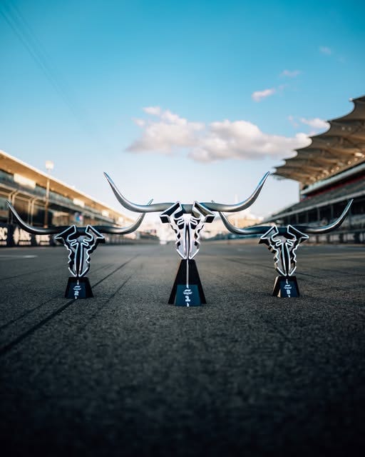
It may seem that Formula 1 focuses on one major championship (or two, if you’re thinking of both the driver’s and constructors’ championships), but it’s made up of a constellation of separate races and the prizes that go with them. This year’s United States Grand Prix had a design that had the whole world talking. The race, which takes place in Texas, had a prize that was two mirror images of the track with a pair of steer-like longhorns.
So I got to thinking, what makes a “good” championship trophy, anyway? Why do we instantly like some, dismiss others, and debate over a portion of the rest like they are movies starring Vin Diesel and/or Mark Wahlberg? Why did the old XFL (2023) trophy look so cheap?:
Why does the FIFA World Cup trophy look great (albeit being also tiny)? Truly, what makes a trophy great? Is it the design? Is it the prestige of the person or team that gets to hold on to it? How long has the trophy itself been in operation? For one, it can’t JUST be how much is the perceived value, or else the College Football Coaches’ Trophy would be on everyone’s mind:

I’m not the only one to ask this question. A couple of years ago, Bleacher Report ranked its favorite championships of all time, tackling the very same issue. Like most people, they decided that the Stanley Cup was the most beautiful/notable trophy on the planet.
Is there really a better trophy in all of pro sports than Lord Stanley’s Cup? No. Not even close.
The winner of the NHL’s Stanley Cup Finals receives this trophy, which is the symbol of the sport.
The body of the Cup has the names of each player, as well as coaches and management from past winners.
When the Stanley Cup is in your presence, or you hear the TV announcer exclaim, “The Cup is in the building,” you just get chills down your spine. You don’t even have to be a diehard hockey fan to feel the energy. - Bleacher Report
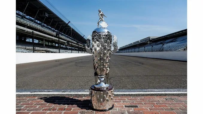
Color me in the minority here, but having the names of the past winners inscribed on a trophy like how Grim Reaper would mark the souls it’s taken is a little creepy to me personally. Like, I would have to assume the entire roster of the 1905 Ottawa Silver Sevens is simply not walking the Earth anymore. And what’s even more wild is that Lord Stanley’s Cup isn’t even the only trophy that does that. Have you seen the Borg-Warner Trophy? It’s a 120-pound cup prize that’s given out for winning the Indianapolis 500.
See those bumps? That’s the protruding FACES of all the past winners(!):
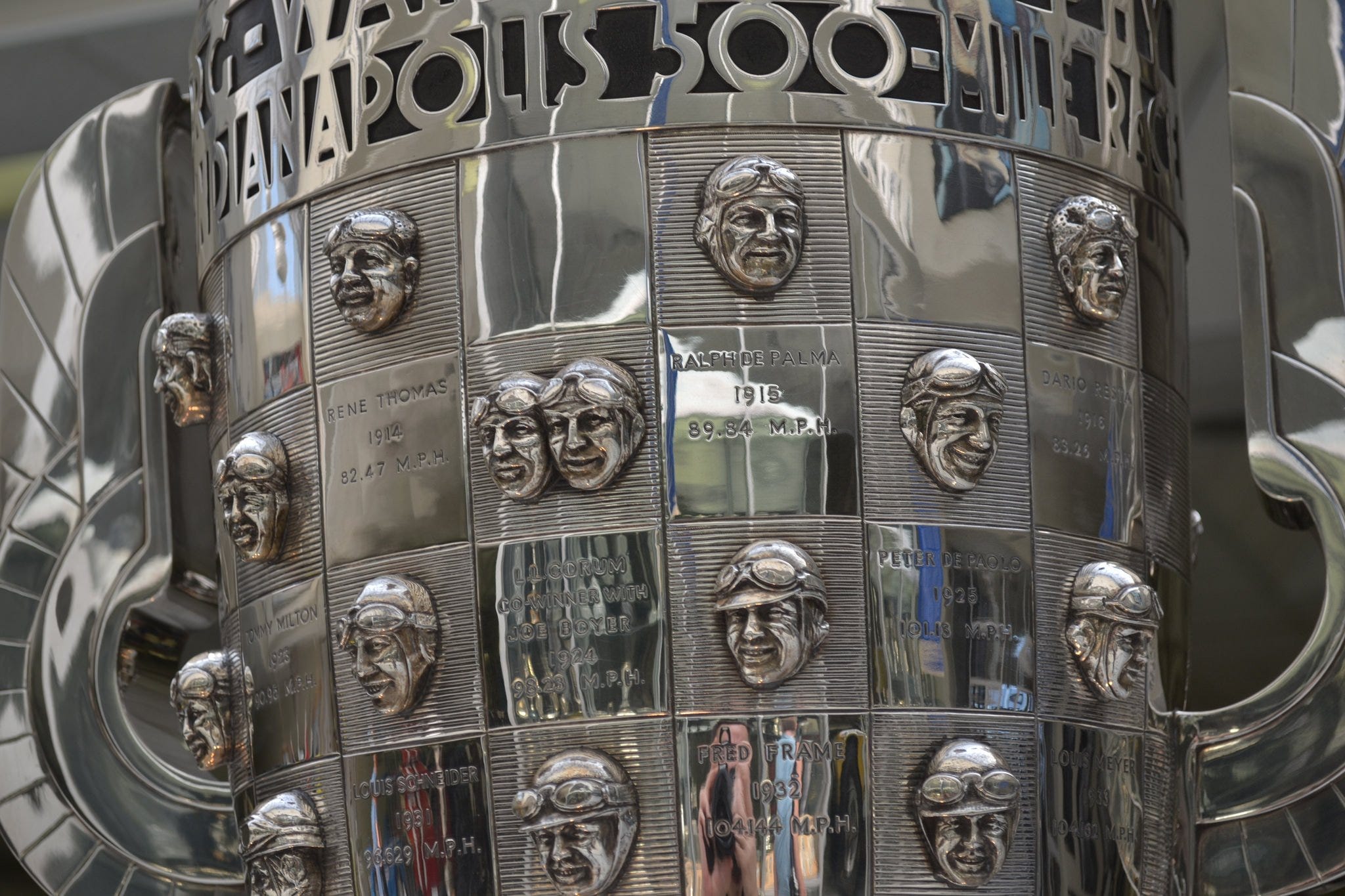
Tell me that doesn’t look like some enchanted prison for wayward spirits that pissed off a wizard or something.
But back to the cow-shaped Formula 1 trophy. The United States Grand Prix is no longer the only US-based race on the calendar anymore. And while Austin, Texas can’t compete with the glamor of the Miami or Vegas races, it was a bold design that kind of reminds people there’s a striking tradition at that racecourse.
But now that I look at it again, it too is giving off spooky relic vibes. Maybe that’s the cheat code after all. We just need more horcruxes in sports.